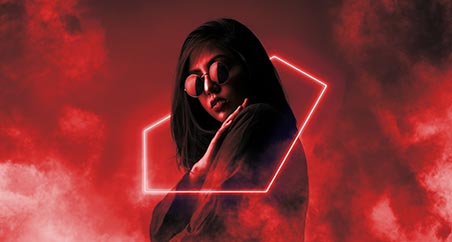

Why are stop signs red, and walk signals green? Why are your notification icons red on your phone? Why is Facebook’s logo blue?
Color Psychology explores how different shades and tones evoke different feelings for different people and can be used to motivate and create the required energy and attitude for an environment.
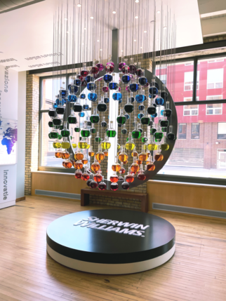
Muzo holds a unique “eco” color palette created with color psychology in mind that has been developed in partnership with Sherwin-Williams color experts, and Muzo Design Lead, Erika Williams.
Erika tells the story of this journey of color, and how we arrived at the beautiful color palette that Muzo now offers…
When our outdoor product lines took off back in 2021, amidst the pandemic and the efforts to get outdoors, I was tasked with creating a “fun” color palette that reflected Muzo’s bold and dynamic product range.
The word fun challenged me.
What is fun to me versus fun to you?
Do we have different interpretations?
As designers, how can we create a “fun” environment?
“I really wanted our eco colors to be more than just a finish selection, and more so a tool to use when assessing how we want individuals to feel in a space.”
We partnered with Sherwin-Williams to create our own custom color palette using their Powdura ECO, which contains 25% post-consumer plastic waste, providing us with much a more sustainable product.
After we decided on the chemistry of the powder it was time to get down to business: Color!
We based our decision on 3 key factors:
1. Muzo’s popular colors – Duh! Don’t forget the Muzo red!
2. Color Trends – Guided by Sherwin-Williams’ annual forecasting
3. Color Psychology – Influencing emotions in the built environment

Muzo’s Popular Colors
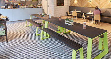
We began with the essentials: the colors that historically performed well for us. From there, we layered in trend insights. Color trends are shaped by all kinds of industries like fashion, tech, automotive, and more. You may notice in our eco line we do not have a true blue but leaned towards a more teal color. This was a decision based on the tech industry and the influence tech has on this generation. Think of your Alexa at home. What is the color of the led light when you call out her name?

Color Psychology
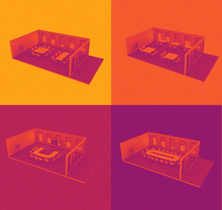
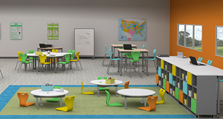
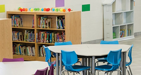
Once we settled on the exact pigment of each color it was time to name them. This is where we wanted to give our colors a bigger purpose. For example, If I wanted to create a “fun” environment which color should I choose? We decided to name each color based on the psychology behind the color. This then becomes a helpful tool when thinking about the environments we are designing and how we want people to feel and interact within that space. We ended with a palette of 9 colors. A mix of vibrant and neutral colors providing us with a diverse selection of inspiration to design with. Our high chroma colors are naturally more energizing than muted/neutral colors. These might be a great place to start when creating a fun classroom!

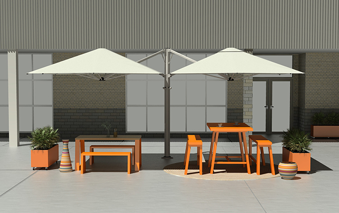
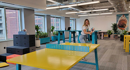
Since the development, colors like Creativity (teal) have been used in art classrooms, Passion (red) in esports clubs, and Collaboration (orange) in outdoor breakout spaces. The palette has allowed us the opportunity to create more than just vibrant spaces, but also shape experiences.

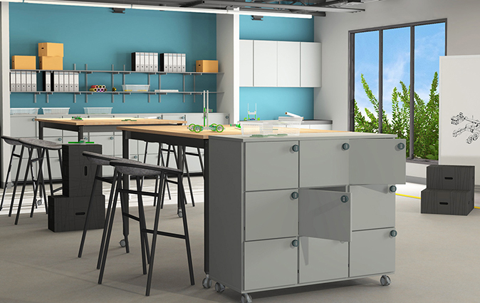
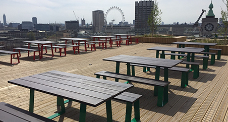
Powder-coated in Pennsylvania
Muzo’s paint team powdercoat all our metal work, from Outdoor Furniture to Kite Table legs, JuiceBots to GoStorage Carts, in the Muzo factory in Hazleton, PA.
Passion (Red) Red gives us the motivation to do our best, doing the things we love. It involves the expression of intense interest and enthusiasm about something. Red excites our emotions, which is why we exert effort to finish a task or achieve a particular goal, especially if it’s something that interests us.
Humanity (Terracotta) This is generally perceived as a positive emotional color, which is associated with kindness, care and gentleness It is also regarded as a color which represents nurturing and compassion, and gives one feelings of understanding and acceptance.
Collaboration (Orange) The hue of encouragement, optimism and the confidence of extroverts, combining the physical energy and stimulation of red with the cheerfulness of yellow. Orange can inspire courage, enthusiasm, rejuvenation, and vitality and is also said to have a stimulating effect, particularly on the appetite.
Optimism (Yellow) Yellow stimulates the mind and intellect, sparking creativity and new ideas. It’s used for Post-it® notes and legal pads for this reason. As the lightest hue, yellow is uplifting, offering hope, happiness, and fun, creating a cheerful and playful atmosphere.
Imagination (Green) Being most common in nature, Green symbolizes lush forests and rich environments It’s the most soothing color for the eye, embodying harmony, tranquility, and peace Green promotes growth, renewal, optimism, hopefulness, and balance.
Creativity (Teal) Teal signifies trustworthiness and reliability, often used in design to evoke calm and composure. It suggests stability and endurance, making it popular in technology, medical, and educational branding. Teal reduces stress, providing a serene backdrop that encourages clear thinking and concentration.
Peace (White) White is often associated with purity, innocence, and cleanliness. It can create a sense of spaciousness and openness, making rooms feel larger and more expansive. Psychologically, white promotes clarity of thought and enhances creative thinking.
Balance (Gray) Gray is a neutral, balanced color symbolizing compromise and detachment, and evoking feelings of calmness and sophistication. Often associated with maturity, intellect, and formality, gray is versatile and understated, making it a popular choice 1n design and fashion.
Zen (Black) Black is a powerful and versatile color. It symbolizes authority, elegance, and sophistication, often evoking feelings of power and formality. However, it can also be associated with negativity, fear, and sadness. Black’s dual nature makes it both mysterious and commanding, often used to convey seriousness and depth.
If you’d like a sample of the palette then drop me an email: Erika@muzo-works.com, and as you consider the design of your next project, I’d love to collaborate and show how our Muzo ECO palette can bring your ideas to life.
Thanks for reading!

• Andrew J. Elliot & Mark A. Maier (2014). Color psychology: Effects of perceiving color on psychological functioning in humans. Annual Review of Psychology.
• Satyendra Singh (2006). Impact of color on marketing. Management Decision.
• Lauren I. Labrecque & George R. Milne (2013). To be or not to be different: Exploration of norms and benefits of color differentiation in the marketplace. Marketing Letters.
• Karen B. Schloss & Stephen E. Palmer (2010). An ecological valence theory of human color preference.